Other Projects
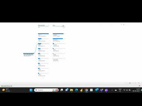
Project 2 - Decomposition Chart
As an enthusiast of Microsoft Power BI Visualization, I'm always seeking tools to interpret data effectively. Recently, I've been impressed by the Decomposition Chart's capabilities. It breaks down measures by multiple dimensions, facilitating visual comparisons and deeper data understanding. Its flexibility and interactivity make it invaluable for analysts and business users alike.

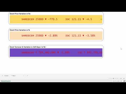
Project 3 - Scroller Chart
In my experience with Microsoft Power BI, the Scroller chart has revolutionized how I present time-series data. Its seamless navigation through large datasets while maintaining granularity is impressive. Zooming in and out swiftly enhances trend analysis. The sleek design simplifies data comprehension, making it ideal for stakeholder presentations. Highly recommended for data analysts seeking powerful visualization tools.

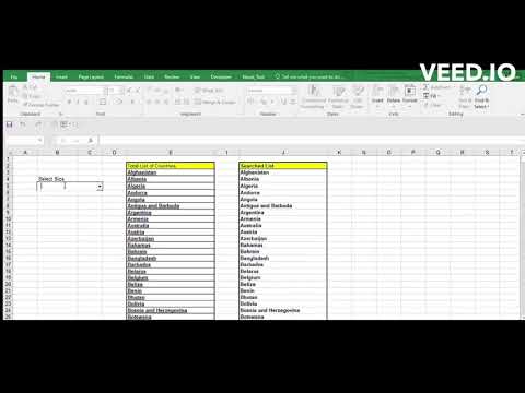
Project 4 - Searchable Drop-down Excel
I was thinking about how useful a Searchable Drop-Down box in MS Excel would be, like the ones in Power BI or Tableau. So, I tinkered with some VBA Codes & Macros and managed to create one myself. 😀 Just to note, this feature is now available by default for Office 365 Users.


